my role: UX/UI, concept development, information visualization
When developing ideas into products, there is often the pressure of time versus verifying that the idea is worthwhile.
The hypothesis is that in the design environment there is a need for a digital tool that combines the convenience of getting fast feedback on different aspects of a project with a community of creatives that can provide that feedback.

The team working on this project was formed out two members, me and another fellow designer. The process included idea, research, insights, validation to execution and business case.
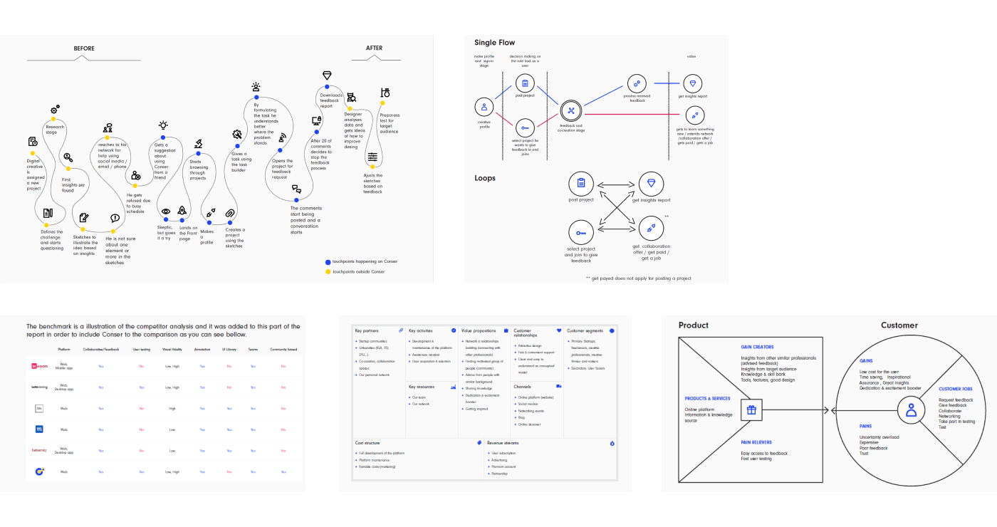

After completing both qualitative and quantitative analyses, a sum up of the most important findings and conclusions have been made. This synthesized information guided the development phase and the most important point were:
In order to prototype the tool, some key elements had to be in place. Conser was defined as a simple, collaborative software, designed to fit the modern workflow.
The main aspect of the product is interconnecting creatives in order to give and receive feedback on different ideas. The additional one is user testing. With this tool we aim to improve decision making regarding priority of features and provide support for additional iterations of any digital concept.
The solution is based on the hypothesis along with the findings from the research. These insights were the path from the initial idea to the solution and the reason for designing a seamless flat user flow.
Usability is a key characteristic of the platforms UI, because it deals with whether or not the platform is simple to navigate, enjoyable to encounter, and valuable to interact with. These are the main focuses as it plays an important role in further user acquisition. Therefore the navigation must be intuitive, allowing the users to go through the processes effortlessly, stay informed, and be provided with continuous guidance on the next steps.
A well designed and structured website can help greatly with increasing user experience. Furthermore the aim was creating a pleasant environment, where people would feel comfortable with posting their ideas, asking for help and collaborate with each other.

Based on the purpose of the tool, according to the findings from the research, the light overall look and feel is based on a mix of interaction principles.
Affordance, discoverability and feedback increases the ability of the user to perceive and understand available options, how they can be performed and provides reaction of the system to these action. Instructions of how the tool works outlines the conceptual model.
Mapping using gestalt is used to construct the relationship between elements and navigate seamlessly the interface areas and ensure an intuitive user flow.
Simple style was used for easy overview and a logical feel is chosen based on the user research, confirmed by the pretotyping session, and focused on flat 2.0. Subtle shadows, highlights and layers are used to create depth in the UI. Focus and action colors are used in sufficient contrast with the different UI elements. Colors guide users attention and lead them through the processes.
Visual elements are used for optimizing usability - still and moving images - banners, video teasers, gifs and tooltips.
Based on our initial design approach, User Centered Design (UCD), which is focused on the usability of a platform or the inside of a product, we were able to map out the current user flow and main features of Conser.
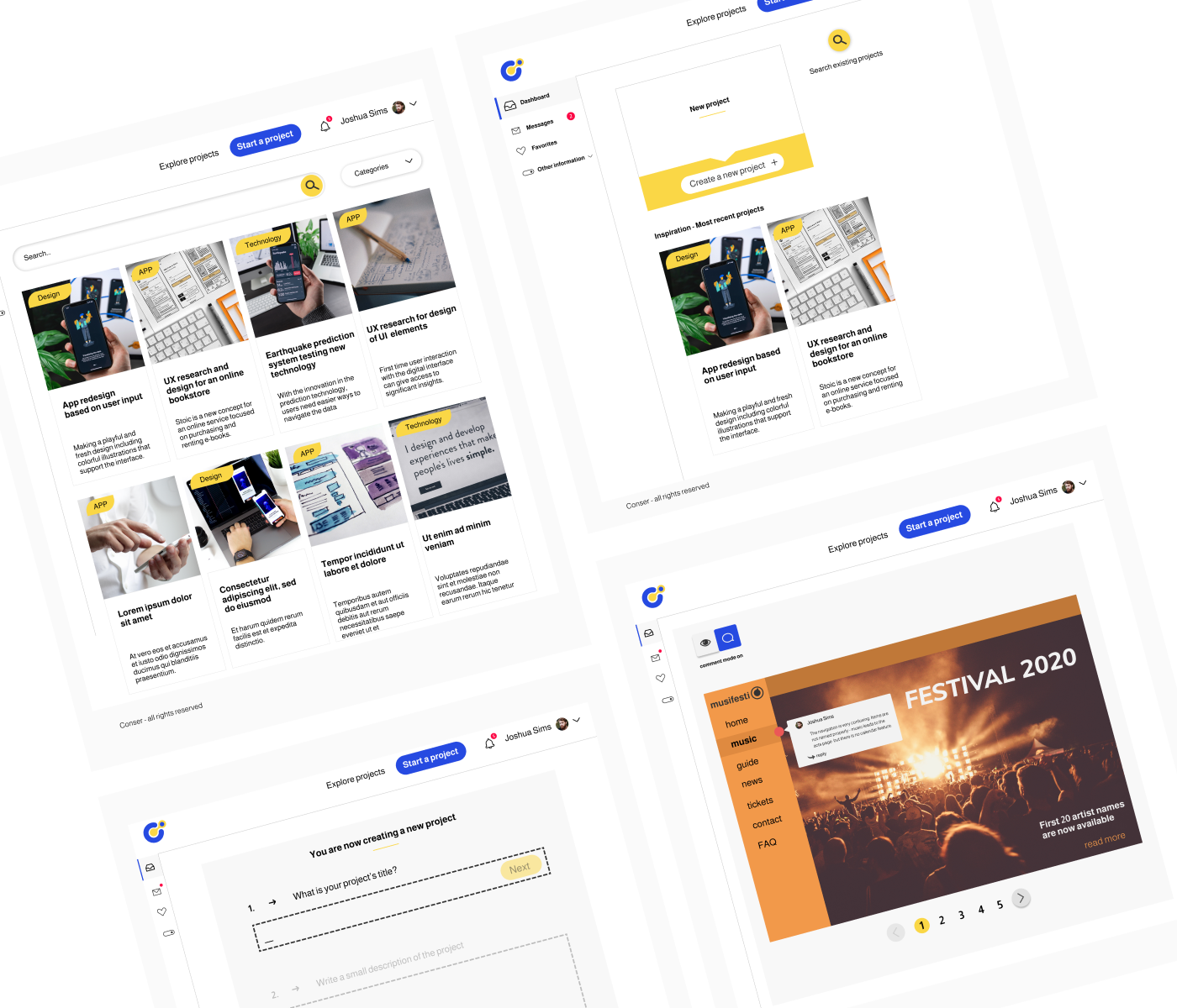
The landing page was designed with the user conversion in mind and some elements were prioritized:
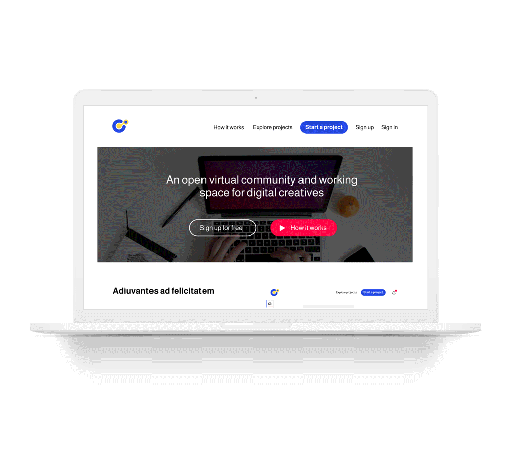
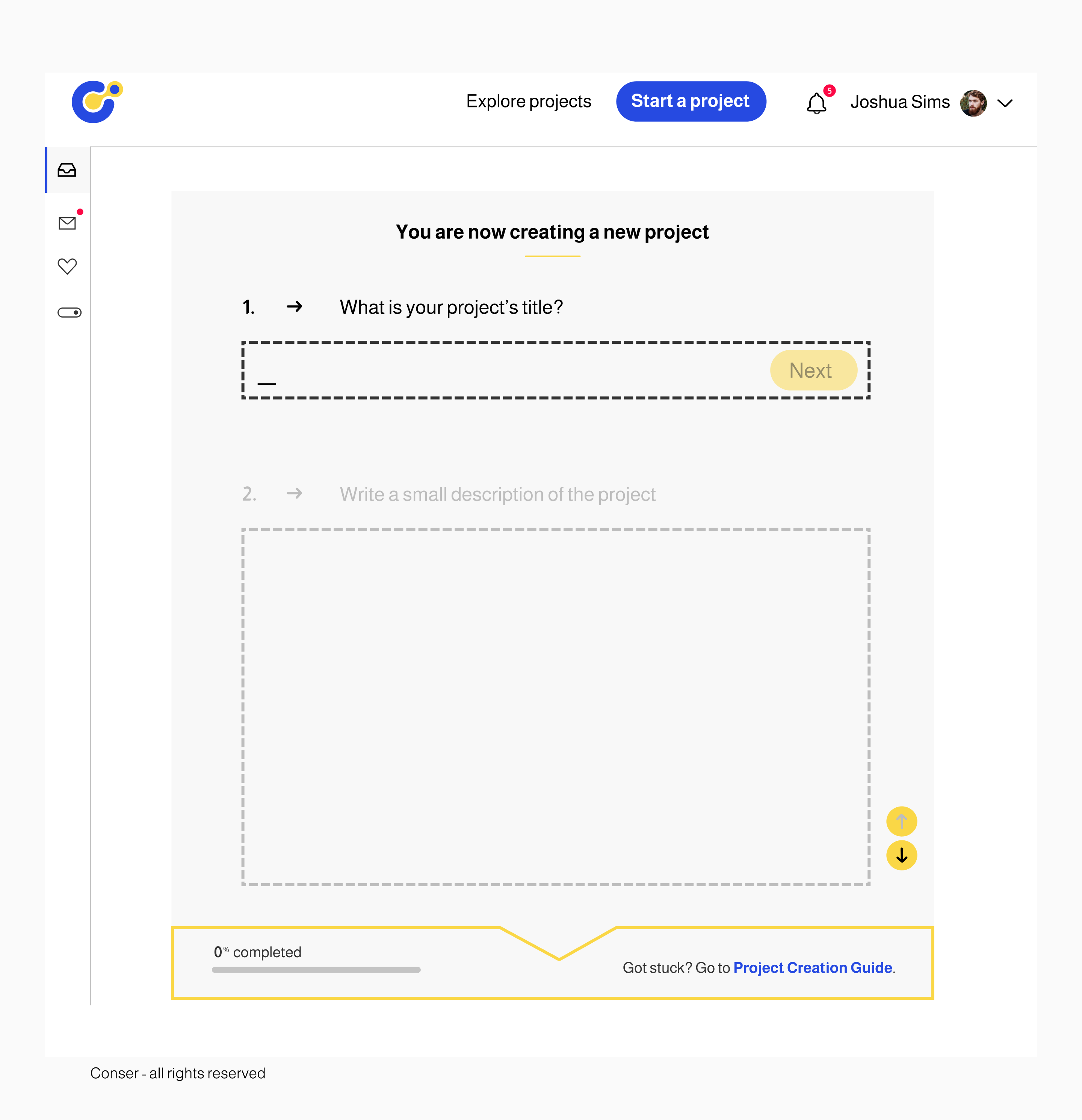
This is the page where the user can have an overview over their activity and perform different actions. The Dashboard can only be accessed on the signed-in state, where it acts as a frontpage for the user. This is the reason why, as mentioned before, when clicking the logo after signing in, it will redirect you to this page.
It has both a top and a side navigation. Top navigation supports the user in log in and out of the platform and in between exploring project, and starting a new one. Side navigation is composed out of three main buttons: “Dashboard”, “Messages”, “Favorites”. The side navigation can be toggled and hidden when is not relevant for the user in order to give more space on the screen.
The "Explore" page has a search and a categories split, while the "Project" can be used to create a new project by defining and uploading information, requesting feedback or accessing an existing project to provide feedback. "Open" and "Closed" are used to define the project mode in relation to feedback.
Conser is a prototype of a tool created for community feedback and user testing. At the moment of its creation, in the rise of digital collaborative tools, it had the potential to revolutionise the way we see digital creative work today. The initial assumption was to see all creatives as our target audience and we narrowed it down first to digital creatives.
Further we observed that only the ones that work independently, in small design teams, or in similar contexts, actually present the need of a tool as Conser. They were the ones to embraced the idea. Throughout research it was observed that the target audience works with a big pressure of time, but in essence is formed out of enthusiastic people, curious, willing to give a try to new tools and to learn more.
While building the community feedback part of the tool, we kept in mind that the user testing part of it is still just at the stage of idea.
While developing Conser, one aspect considered as very important was to focus upon and include as high priority in the future improvements is the tone of voice.
Due to the fact that Conser is set up as a community tool, it requires a clear set of behavior rules on the platform and a clear way of communicating them. Even more since the conversation bot aims at addressing users directly, this tone of voice is an essential part of Conser’s identity.
Another future improvement was related to the feedback report and could go under the name of "Feedback Report Editor". While downloading plain text and visuals is a start, during the brainstorming session with the interviewees and the staging experiment, it was observed that organising the feedback could take the experience one step further.
The "Feedback Report Editor" is an additional mode of the Feedback/Collaboration page. This would be the most useful when the feedback annotation is made in a high amount. The project owner needs to select the relevant information and that might be overwhelming. By using checkboxes to select the comments considered relevant and named categories marked by color labels, to re-arrange the content, the feedback report could be customised. The aim of this feature is to make feedback processing more playful and easy to manage, which matches exactly with Conser’s overall user friendliness. This feature presents also potential in being repurposed in the user testing side of the platform.